Monday, June 29, 2015
Sunday, June 28, 2015
Submission - Moving Elements
Lecture Hall Light Blocker
The light blocker in the lecture hall features black screens that cover the windows as soon as the computer connected to the projector is turned on. The lecturer can also control the blocker at will. The light blocker will retract after the computer has been turned off. It darkens the room for the projector and blocks views out of the room.
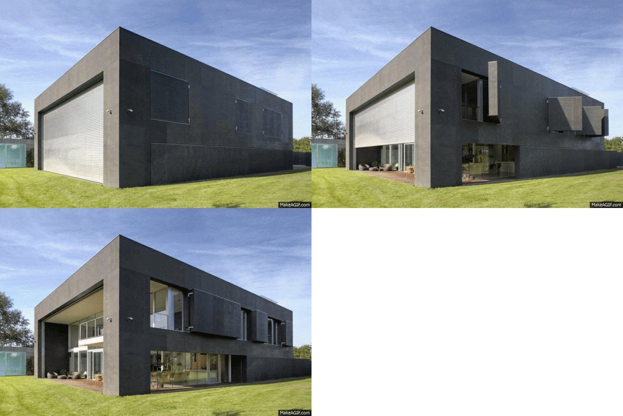
Gallery Moving Facade
The moving facade outside of the walls of the gallery is stimulated by activity within the room. Using sensors, the facade moves to restrict the views outside of the room, to allow the focus of the guests inwards, rather than outwards. After the room no longer has any activity going on within it, the facade will retract, opening the room up to the surrounding views.
Submission - Textures


In my bridge, I used three textures, one from my Linear category, Rotation category and Sway category. The Linear texture was used on an elevator that leads people to the Gallery.
I Photoshopped my Rotation texture into a purple fabric texture. I then used this as the flooring in the study room.
And finally, I used the sway texture in the workshop to represent the rooms use for design purposes.
Experiment 3 - Draft Lumion Images
"The Arch"
View from Anzac Parade, in front of NIDA.
View of the building from behind
Lecture Room
The Arch's location on the UNSW campus.
The bridge shown above connects the Square Building with NIDA. The building was originally going to just be the arch portion, however, I added another one of my "cross" perspectives to increase the size of the building.
Saturday, June 27, 2015
Experiment 3 - Inspiration
I want my building to consist of a timber facade. I believe this will allow my building to stand out among the existing buildings on the UNSW campus, as well as add a warm and welcoming feel to the building.
Friday, June 26, 2015
Experiment 3 - Moving Element Research and Inspiration
Among the three selected examples, my favourite would have to be the second one. I like the way the room is concealed in such a simple way and that it can open in such an elegant way that looks good. I would like to do something of the sort for my gallery.
Experiment 3 - Textures
The Rotation, Scale
and Linear textures were requirements of this part of the experiment. We were
then tasked with coming up with the kind of movement we do day to day so I
chose Shift, Sway and Bobbing. These were chosen as I do not get much time to
move around much, due to being busy with assignments, as well as my chronic
back pain. So I chose Shift, as I shift my position whilst working, and Sway
and Bobbing because, depending on my current mood, I like to dance.
Thursday, June 25, 2015
Experiment 3 - Turning Floor Plan into Section
This week, we were given the task of choosing the floor plan of a famous building, altering it to work with the requirement of the Bridge, and the turning this into a section which would then be used as a section within our bridge.
Our group chose the Villa Mairea.
I Modified the floor plan to become the following:
I then recreated the modified floor plan in Sketchup and turned it into a section:
Experiment 3 - Placing the Perspective in Location
Experiment 3 - One and Two Point Perspectives
Week 1
Altering the 3D cross in one and two perspective form.
I turned the cross into the following perspectives:
Friday, June 19, 2015
Experiment 3: Article Mashup
Something as important
as architecture cannot be founded upon arbitrary bases. One of the most
interesting trends in architectural materials of recent years is the increase
in use of weathering steel - more commonly referred to by its trademark name, Cor-Ten. Thought
the material has been around for decades, first being used
for architectural purposes in the Eero Saarinen-designed
John Deere Headquarters in 1964, the material has seen a surge in popularity in
the last decade or so, being used in everything from individual houses and tiny
kiosks, to SHoP's design
for the Barclays Center in Brooklyn.
For the best part of a
century, architectural discussion has been dominated by modernism and
other related forms of futurism and functionalism. We would prefer an
architecture that is consistent with human feeling, and in which design
decisions are based on observation and empirical verification. For some, this
constant invocation of the radically new has begun to look quite tired. In the
1980s looking backwards for inspiration famously brought us the adaptive
and populist postmodernists, but also emerging at this time was New
Classical architecture, which completely rejected any continuity with modernism
and returned instead to traditional rules.
Salingaros, Nikos 2015, Unified Architectural Theory, Chapter 13, ArchDaily, Accessed 19 June 2015, <http://www.archdaily.com/636876/unified-architectural-theory-chapter-13>
Stott, Rory 2015, AD Round-Up: 9 Projects that make Creative Use of Cor-ten Steel, ArchDaily, Accessed 19 June 2015, <http://www.archdaily.com/628127/ad-round-up-9-projects-that-make-creative-use-of-cor-ten-steel>
Goodwin, Dario 2015, 6 Classical Building That Are Younger Than You Think, ArchDaily, Accessed 19 June 2015, <http://www.archdaily.com/621256/6-classical-buildings-that-are-younger-than-you-think>
Subscribe to:
Comments (Atom)


